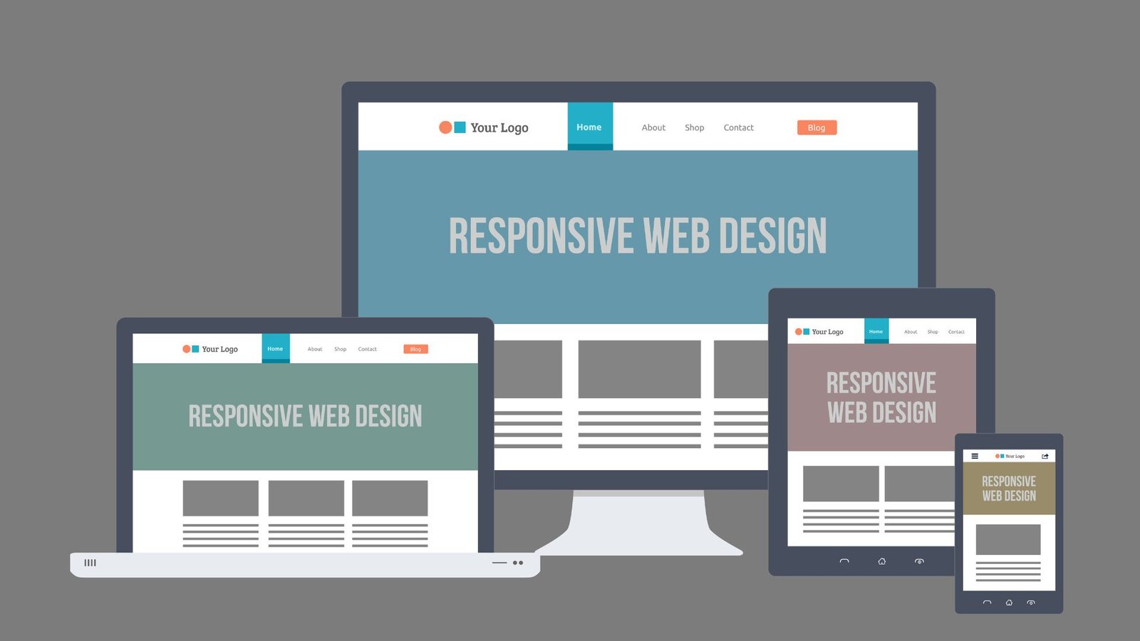
In today’s digital landscape, ensuring your website looks and functions well on all devices is essential. Responsive web development allows your website to adapt to different screen sizes and resolutions, providing a seamless user experience. Here’s a step-by-step guide on how to build a responsive website that performs well on desktops, tablets, and smartphones.

Understand Responsive Design Principles
Fluid Grids
A fundamental principle of responsive design is using fluid grids. Unlike fixed-width layouts, fluid grids use percentage-based widths rather than fixed pixels. This approach allows elements on your website to resize proportionally based on the screen width. To implement fluid grids, use CSS properties like width and max-width with percentage values.
Flexible Images
Images should be flexible to ensure they scale correctly with different screen sizes. Use CSS to set the max-width property to 100% to make images responsive. This ensures images scale down with their container without exceeding their original size, maintaining visual integrity across devices.
Media Queries
Media queries are essential for applying different styles based on the device’s characteristics, such as screen width or resolution. They allow you to define breakpoints where your website’s layout changes to accommodate various screen sizes. Use media queries in your CSS to adjust the layout, font sizes, and other styles for different devices.
Mobile-First Design
Start with Mobile
Adopting a mobile-first approach means designing your website for smaller screens first, then scaling up for larger screens. This approach ensures that the core functionality and content are optimized for mobile devices, which are often used more frequently than desktops. Begin your design process with mobile layouts and progressively enhance for larger screens.
Optimize Touch Interactions
Ensure that interactive elements are easy to use on touchscreens. Buttons and links should be large enough to tap comfortably, and there should be sufficient spacing between interactive elements to prevent accidental clicks. Test your website’s touch interactions on real devices to ensure a smooth user experience.
Use Responsive Frameworks
Bootstrap
Bootstrap is a popular front-end framework that simplifies responsive web development. It provides a grid system and pre-designed components that adapt to different screen sizes. By using Bootstrap’s responsive classes and components, you can quickly build layouts that work well on various devices.
Foundation
Foundation is another responsive front-end framework that offers a flexible grid system and a range of UI components. It allows for more customized responsive design and provides tools for creating accessible and mobile-friendly websites. Foundation’s modular approach enables you to include only the features you need.
Test Across Devices
Cross-Browser Testing
Testing your website across different browsers is crucial to ensure compatibility and consistent behavior. Use tools like BrowserStack or Sauce Labs to test your website on various browsers and devices. These tools provide virtual environments to identify and fix browser-specific issues.
Responsive Design Testing Tools
Responsive design testing tools help you preview how your website looks on different screen sizes. Tools like Chrome DevTools, Responsinator, and Responsive Design Checker allow you to test your site’s responsiveness and make adjustments as needed. Use these tools to ensure your website performs well across all devices.
Performance Optimization
Optimize Assets
Optimize images, videos, and other assets to improve load times and performance. Use image formats like WebP for better compression and faster loading. Compress and minify CSS and JavaScript files to reduce file sizes and improve page load speeds.
Implement Lazy Loading
Lazy loading defers the loading of off-screen images and other resources until they are needed. This approach reduces initial load times and improves performance, especially on mobile devices with slower connections. Use the loading="lazy" attribute for images and lazy-loading libraries for other assets.
Accessibility Considerations
Ensure Keyboard Navigation
Make sure your website is accessible via keyboard navigation. Test your site using only the keyboard to ensure all interactive elements are reachable and usable. Implement keyboard focus styles to indicate which element is currently selected.
Use Semantic HTML
Use semantic HTML elements to improve accessibility and search engine optimization (SEO). Elements like <header>, <nav>, <main>, and <footer> help define the structure of your page and make it easier for screen readers to interpret content.
Continuous Improvement
Gather User Feedback
Regularly collect feedback from users to identify areas for improvement. Use tools like Google Analytics to track user behavior and identify any issues with your website’s responsiveness. Address any problems promptly to ensure a positive user experience.
Stay Updated with Trends
Stay informed about the latest trends and best practices in responsive web development. The field of web design is constantly evolving, and keeping up with new technologies and techniques will help you build better, more adaptable websites.
Conclusion
Building a responsive website involves understanding and applying key design principles, using responsive frameworks, and testing across different devices. By adopting a mobile-first approach, optimizing performance, and ensuring accessibility, you can create a seamless user experience across various screen sizes. Continuously gather user feedback and stay updated with industry trends to keep your website effective and user-friendly. Embracing these practices will help you build adaptable and high-performing websites that meet the needs of today’s diverse digital landscape.


